An Accessible Launcher for Astro Websites
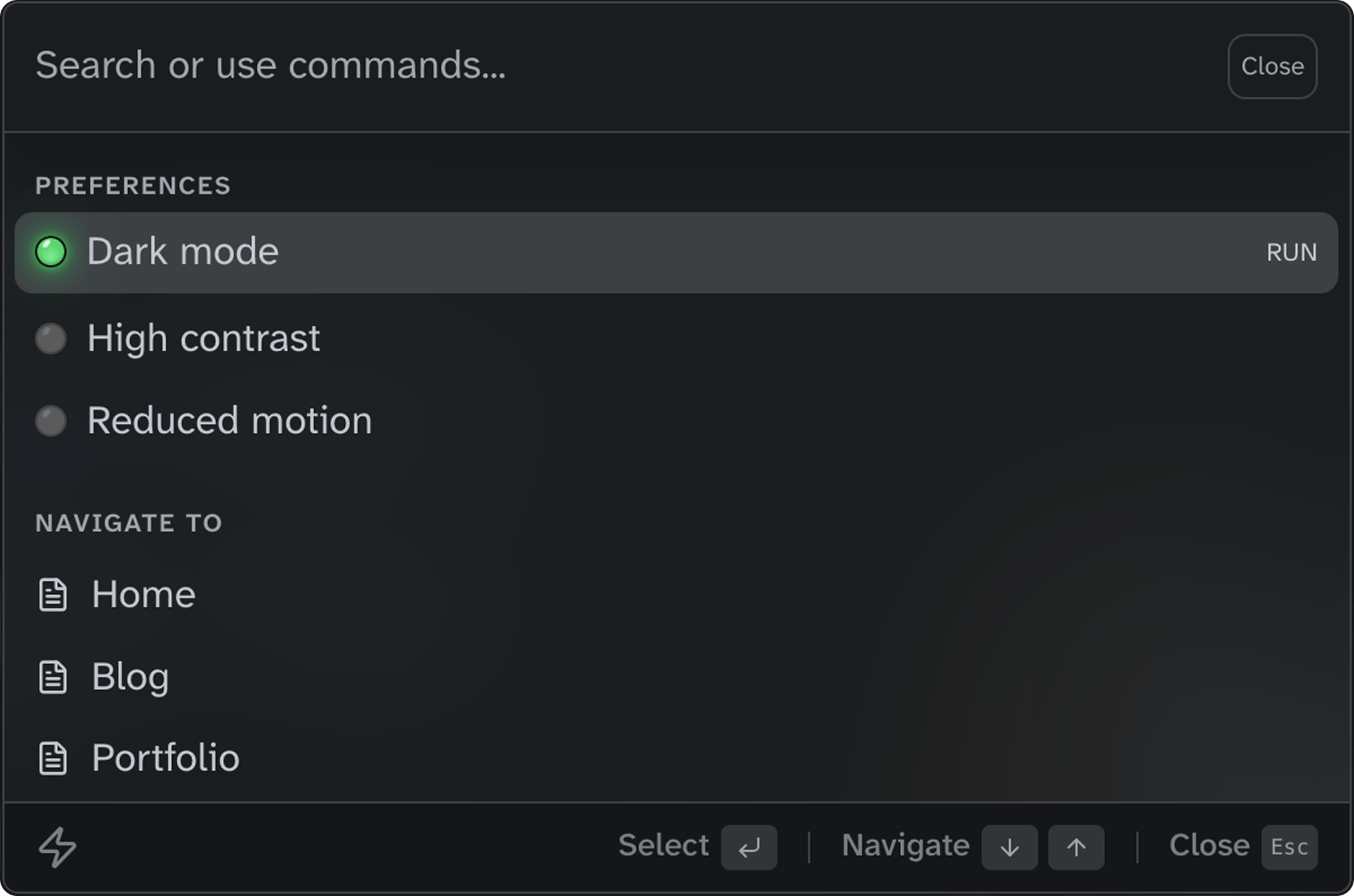
Flexible trigger options
Place the trigger anywhere in your layout. Choose from icon-only, compact, or full-width styles, all responsive and container-query ready. Try it out by clicking on of the buttons or using the keyboard shortcut (Cmd/Ctrl+K).
Composable components
Build your command palette with simple, declarative components. Import, compose, and ship—no complex configuration required. Group navigation links, add preference toggles, and let your users find anything by typing a few characters.
Every component is fully typed with TypeScript and designed to work together. Customize the appearance with CSS custom properties, or extend with your own action handlers to create the perfect command experience.
<Launcher id="site-launcher">
  <LauncherList>
    <LauncherGroup label="Preferences">
      <LauncherItem
        type="action"
        label="Dark mode"
        onAction="toggle-dark-mode"
       />
    </LauncherGroup>
    <LauncherGroup label="Navigate to">
      {pages.map(({ label, href }) => (
        <LauncherItem
          type="navigation"
          label={label}
          href={href}
        />
      ))}
    </LauncherGroup>
  </LauncherList>
</Launcher>
Features
WAI-ARIA combobox
Built on the WAI-ARIA combobox pattern with proper roles, states, and live region announcements for screen readers.
Full keyboard support
Open with Cmd/Ctrl+K, navigate with arrow keys, select with Enter, and close with Escape. No mouse required.
Instant fuzzy search
Client-side search with keyword matching. Find any page or action by typing just a few characters.
Light and dark mode
Automatic theming via CSS light-dark() with LED-style toggle indicators that sync with your site preferences.
Preference toggles
Built-in sync with accessible-astro-components for dark mode, high contrast, and reduced motion preferences.
Fully customizable
Extensive CSS custom properties for colors, spacing, and dimensions. Low-specificity selectors make overrides easy.
i18n ready
All UI text is customizable via props. Translate placeholders, labels, and hints to any language.
TypeScript included
Full type definitions for all components, props, and events. Catch errors at build time.
Zero dependencies
Pure Astro components with no external runtime dependencies. Just install and use.